Abstract, now with Dark Mode
Not a sight for sore eyes. We’re rolling out a system-wide Dark Mode for our MacOS and web apps.

With macOS Mojave, Apple introduced a much-loved feature for those of us who like to burn the midnight oil: Dark Mode. And here at Abstract, we’re not only all about streamlining your design workflow. We want to make that workflow easier on the eyes, too.
We’ve seen numerous apps launch support for this new (awesome) feature, and today we’re excited to share that we’re turning down the lights and rolling out a system-wide Dark Mode for Abstract’s macOS app and our web app.
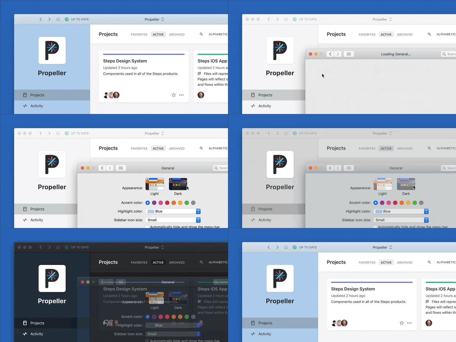
In our macOS app, the setting will reflect whatever setting you’ve chosen for your system.
We’re slightly biased, but we think our Dark Mode is a looker. For those of us who are night owls, and often designing in the dark, Dark Mode helps reduce the strain caused by bright white backgrounds.

To enable Dark Mode, all you have to do is go to your System Preferences > General > Appearance > Light/Dark. Note that your desktop app can only be controlled via the macOS settings.
In the web app, click on your avatar (top right) and go to “Appearance.” You’ll now have two options to choose from: Light and Dark.
There’s also a third option — “System” — that you’ll see in the Appearance menu. With this feature, you can mirror your user’s system preference, and have it toggle between light and dark. Today, this menu option is only available on Safari Technical Preview (if you’re looking to get technical, you can read about why on Mozilla's developer resources, MDN Web Docs. ) Be on the lookout for this menu option as support for this feature grows.
Dark Mode is one of the many new features we are launching with our latest update. Others include Assets for easier design implementation, Single Sign On, and Teams sections, for easier project organization. All are now available for Enterprise teams.


